Saturday, 8 March 2014
Jubilee Campus Juxtapositions and Plonk architecture

A couple of weeks ago, the East Midlands Branch of the Landscape Institute held their AGM at Nottingham University’s Jubilee Campus. Prior to the main event, where everyone tries to avoid being voted onto the committee (I must have lost again, as I’m still Branch Secretary), we had tour of the Campus itself.
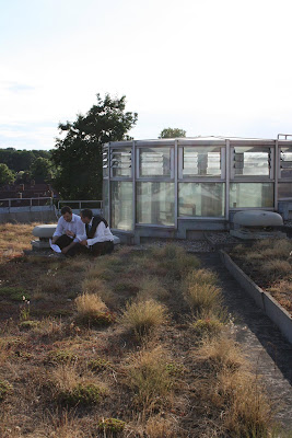
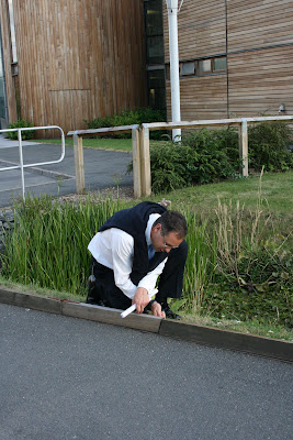
WARNING! The following Blog post contains graphic images of Landscape Architects.

While I’d passed by the campus a few times, and seen plenty of pictures in the architectural press coverage (much of which was highly critical), I was very keen to see it for myself. Contrary to many, I actually thought that the new buildings looked pretty cool.

What I hadn’t really remembered, is that the buildings by MAKE Architects are only a recent addition to the site. The original campus masterplan was produced by Michael Hopkins and Partners, who also designed the first phase of buildings, and opened in 1999. The scheme is based upon sustainable principles and was developed on a brown field site (the former Raleigh bicycle factory). The Djanogly LRC , with it’s single spiralling floor, is the most recognisable building here (and where I took a few rooftop snaps). However, the real focus of the scheme is on the artificial lakes which run through the heart of the campus.


The green credentials are also pretty impressive ; the lakes are used as a giant heatsink, whilst everywhere you look there are ventilation chimneys, swales, photovoltaic cells and green roofs.

Actually, I’m a little unsure about the green roofs – the planting reminds me of the sort of thing you see sprouting from a disused runway.


Ambling along the waterside concourse is a very pleasant thing to do on a sunny, summer evening. Looking over the water to the backdrop of reeds, trees and wildlife – you could almost forget you’re in Nottingham! Whilst timber cladding has become rather passé, the palette of materials used is simple, well balanced and tasteful. You would feel proud to be a student here.


It’s actually some way into the campus before I get my first glimpse of MAKE’s phase 2 buildings, and then rather strangely half hidden behind a building and some car parking. The new buildings are certainly striking.

As you continue south, a new pathway leading to the phase 2 campus, cuts across the main concourse. Where the Hopkins designed campus is all calm and simplicity, this new path is a riot of colours, funky paving, water-features, stone cubes, trees and brightly coloured planting. Someone with a more base mind than I, could draw some sort of significance from the way this path ends in a fountain on the otherwise tranquil lake...

Look its "Aspire" (it’s a pun, it’s an inspiration, it’s a metaphor, it’s a giant ice cream cone).

Wandering round the campus, I had found myself defending MAKE’s buildings to a former colleague, who was convinced that they represented the worst excesses of “starchitects”. I cited Laver’s Law, that Universities should be about new, and optimistic, and finally that they are just ahead of their time. But as I get closer, I begin to doubt my arguments.

Close up and I can begin to understand why I want to like these buildings. Part of me is still the small child that grew up watching sci-fi films and is desperately disappointed by the modern world. Where are the flying cars? Where are the discos with uninhibited space chicks dancing in silver mini-skirts? And where is the lunar colony? MAKE’s buildings are a business park approximation of how I imagined 2010 should look and kind of wish it did. Unfortunately, for all their sci-fi styling, there are some seriously big problems with these buildings. For a start...

... they face straight onto a car park and the arse-end of other buildings (again I can imagine some might to want to use a crude metaphor for this. Not I, natch). Landscape architecture is all about context and setting, whereas these buildings give no regard to their setting and only seem to interact with what immediately surrounds them (notice how the planting is limited to just the building curtilage). When our guide “explained” the thinking behind MAKE’s design I could actually feel myself getting angry. Apparently, the coloured bands represent the underlying strata, planting is inspired by American studies, whilst the east-west axis extends the site... Rubbish. It’s just empty post rationalisation for doing whatever the hell they like.

Plonk architecture isn’t just confined to this scheme. Was the Gherkin designed especially for Swiss Re, or had it been sitting on Ken Shuttleworth’s (Mr MAKE) drawing board, just waiting for an somewhere to stick it? While architecture can create a new character for a place, I think a design is nearly always more successful when it gives some regard to it’s context and setting. Unfortunately, it seems to me that too many designers, driven by their ego, set out to create their own context. Worse still, I think that there is actually a school of thinking in architecture particularly, that wants to actively go against, subvert or contrast with it’s surroundings, because “Hey, it’s a juxtaposition!”

The Hopkins masterplan gives the campus a clear, simple layout and a calm, elegant environ, which MAKE completely disregard .While I want to love MAKE’s addition to the Jubilee campus for it’s futuristic style, it’s contempt for the surrounding context is everything I detest in the design of our built environment. Some may argue that taken out of context these buildings are terrific, but context is everything when dealing with the world we live in.

Weirdly though, as we trudged back to the car park, I found myself wishing that more buildings were shaped like aerodynamic wedges and clad in exotic metails. A few space chicks in mini skirts wouldn’t go amiss either.
Labels:
and,
architecture,
campus,
jubilee,
juxtapositions,
plonk
Subscribe to:
Post Comments (Atom)

No comments:
Post a Comment